AlignAI Website
[Brand identity revamp and website design]
Overview
Brand Refresh and Website Design for AlignAI, a company that turns enterprise AI strategy into governed, business-aligned solutions. The client needed to position themselves as a trusted, innovative solution that brings clarity to complex AI workflows while maintaining a professional, tech-forward aesthetic. I led the brand revamp and website design in Framer, focusing on creating a cohesive visual language that would communicate complex AI concepts with clarity and confidence.
My Contributions
As AI Product Designer at AlignAI, I led the brand revamp and website design. My responsibilities included:
Refreshing the company logo to better align with their vision
Defining a new color palette that conveyed trust and innovation
Designing custom icons for the website that simplified complex AI concepts
Creating compelling product screen mockups for marketing purposes
Designing and implementing the website in Framer
Developing a cohesive visual language across all brand touchpoints
Highlights
Hero Section & Brand Promise
Hero section needed to communicate AlignAI's core value proposition.
Custom icons visualizing key platform benefits.
graphics
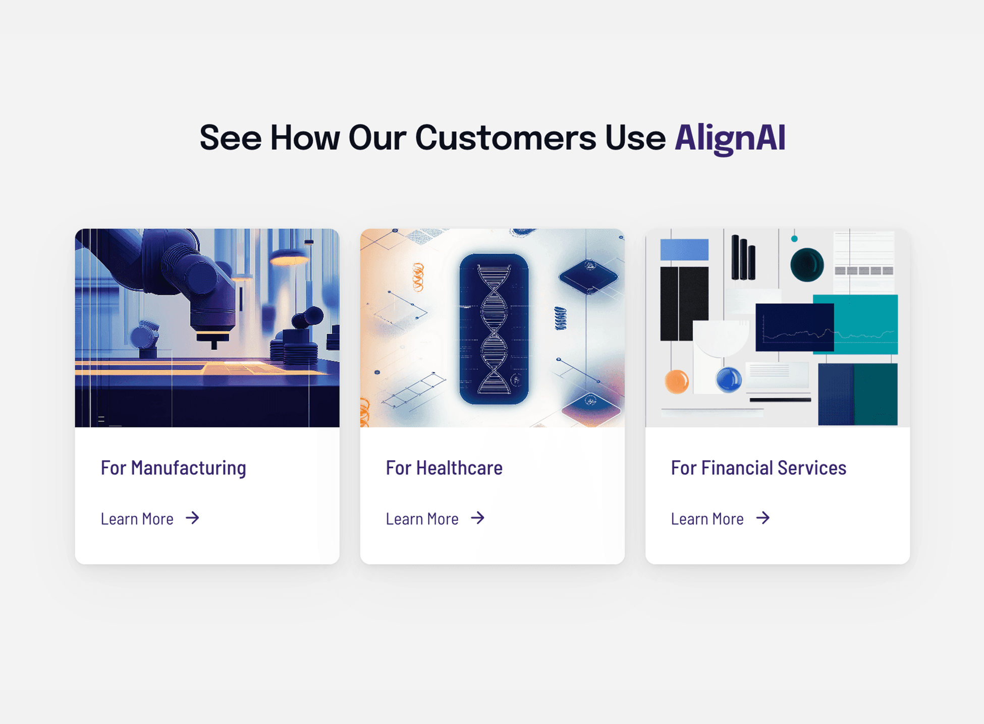
Industry-specific illustrations showcasing cross-sector applications.
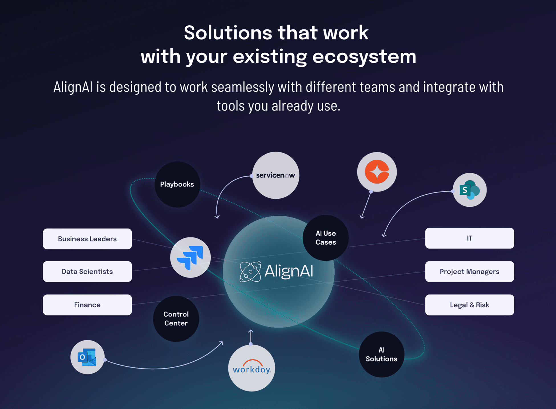
Visualization of AlignAI's integration with enterprise systems.
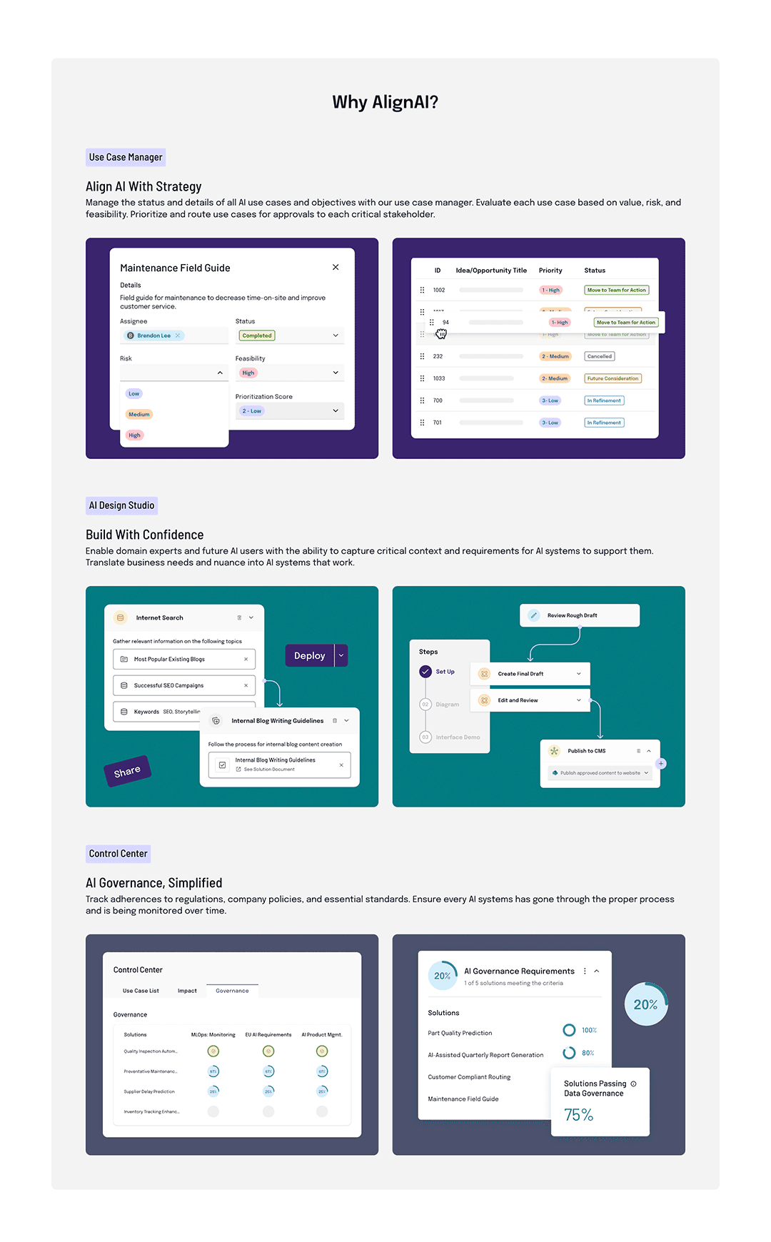
KEY PLATFORM FEATURES
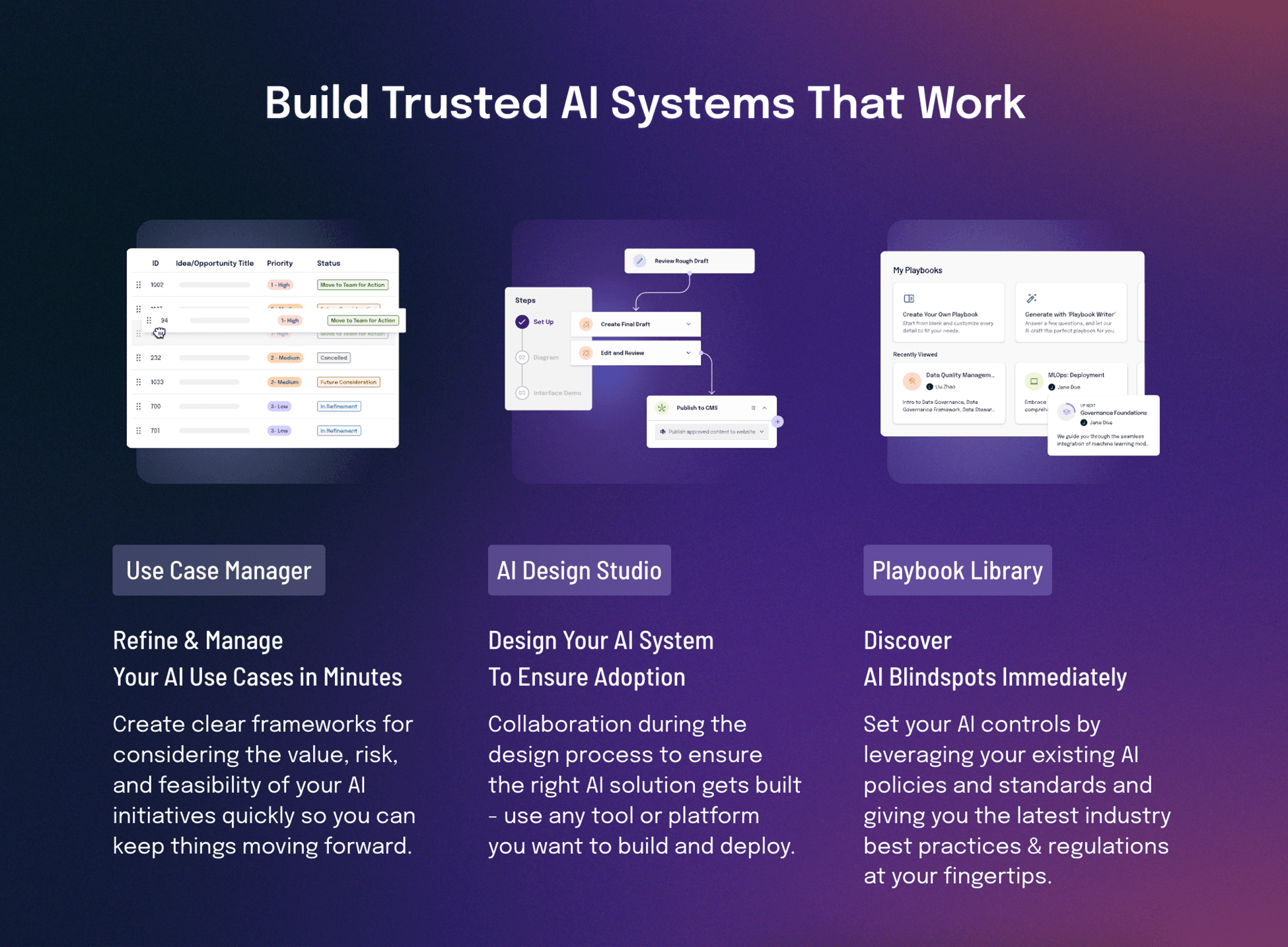
Product interfaces highlighting key platform capabilities.
ICONOGRAPHY
Custom icons and testimonial design.
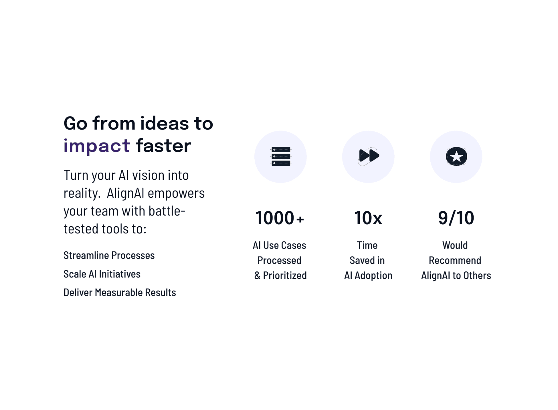
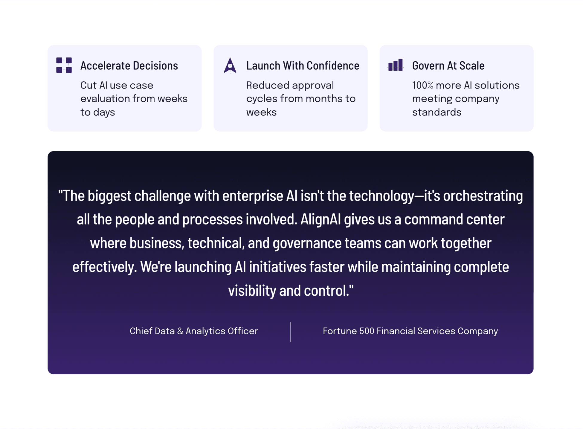
Brand-aligned icons illustrating tangible platform advantages.
Product Mockups
My approach to enhancing product screens for marketing purposes focused on balancing authentic functionality with visual appeal. The process included:
#1
Assessment
I collaborated with the product team to strategically select the screens and features that would best communicate the product's value and tell a compelling story.
#2
Visual Enhancement
I applied the refreshed brand elements to selected product screens, enhancing their visual appeal while maintaining their authentic functionality. I strategically enlarged important components to create clear focal points and better tell the product story.
#3
Simplification
I simplified complex interfaces for marketing contexts, focusing on communicating key value propositions rather than showing every feature.
Brand Identity
Typography


moodboard
The moodboard establishes a visual direction that blends innovation with discovery. Similar to how the 90s represented an era of technological experimentation and digital pioneering, today's AI landscape offers that same sense of exploration and possibility.

color palette
The color system was built around a core palette of midnight blue, teal, and reminiscence purple, with strategic accent colors. Each color was selected to convey specific brand attributes:
Midnight (#0D1B2A): Professionalism, stability, and enterprise-readiness
Teal (#007B83): Innovation, growth, and clarity
Reminiscence Purple (#3A246E): AI intelligence and forward-thinking
Sienna (#D15A31): Energy and attention